Soccer

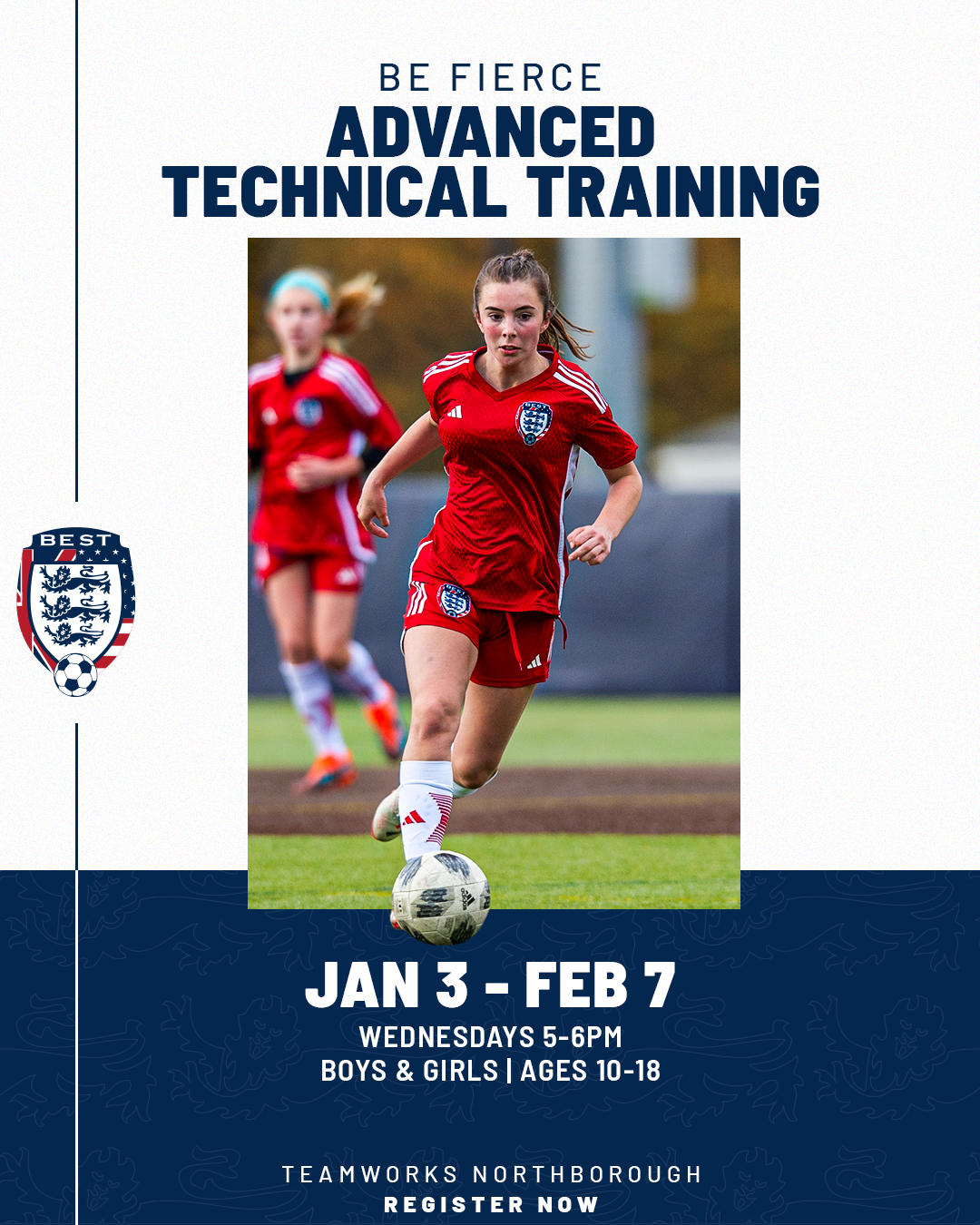
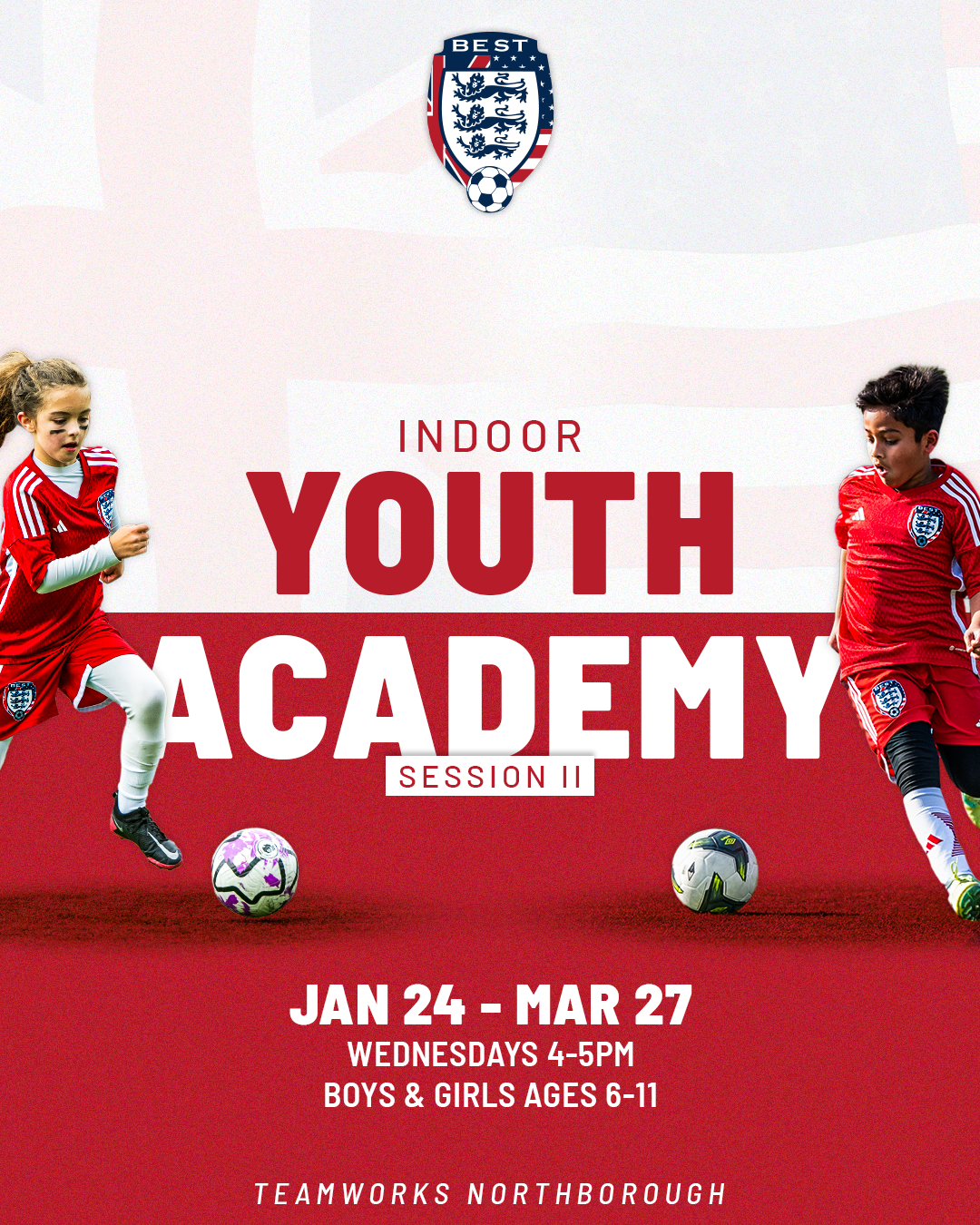
Best FC Branding
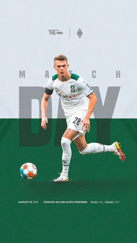
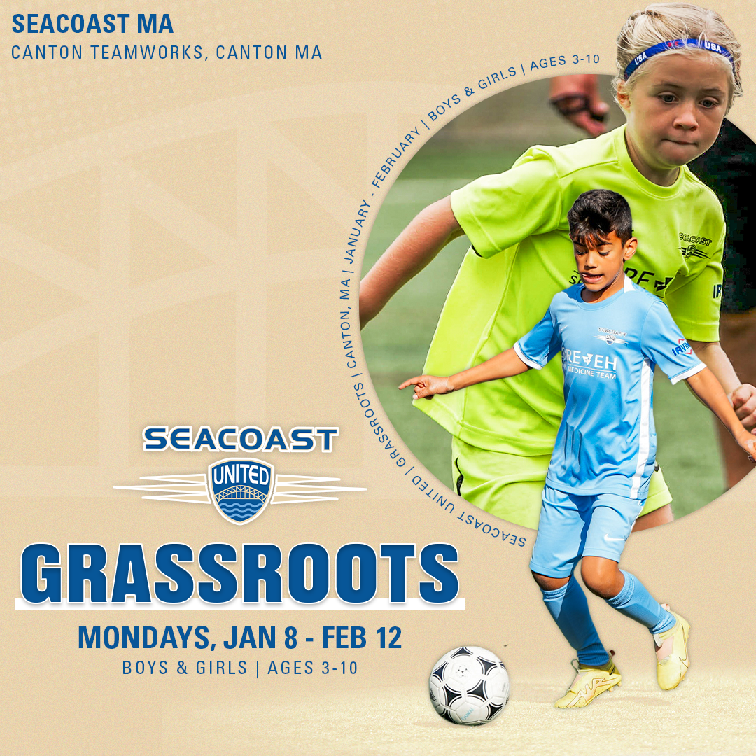
Best FC has two aspects of their brand, a recreational aspect and a elite club aspect. The above graphics were my first project with Best for their elite club brand. The ask was to create a graphic that looks modern. Today, "modern" can mean so many different things for different people. For me, it is clean, sleek, and minimalistic. It focuses on the key information, it does not include gradients or much textures. Typographically, modern for me is sans serif font, something that is universal and has many types of forms, which is why I chose Barlow. To the right are some inspirational graphics that I feel best fit the club Best FC.