Moodboard
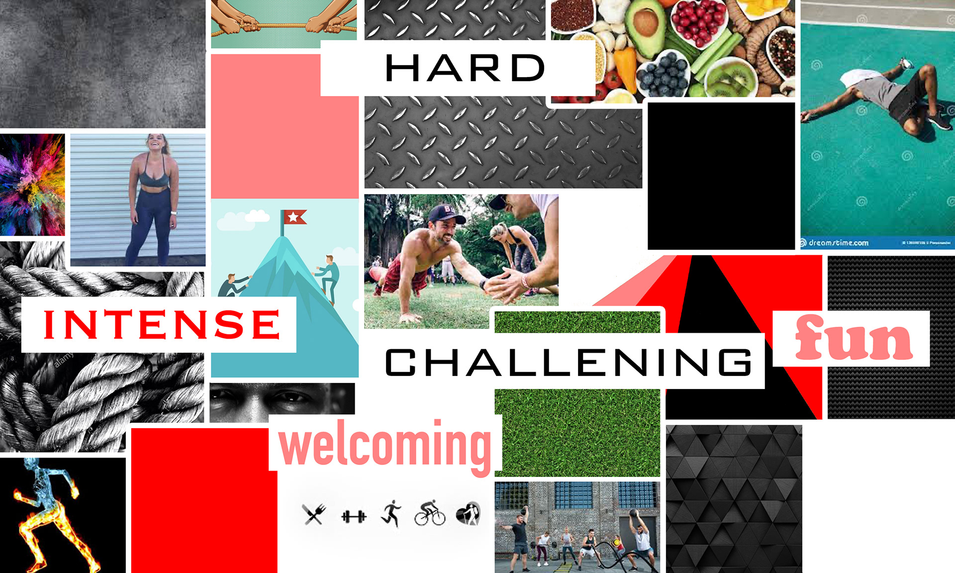
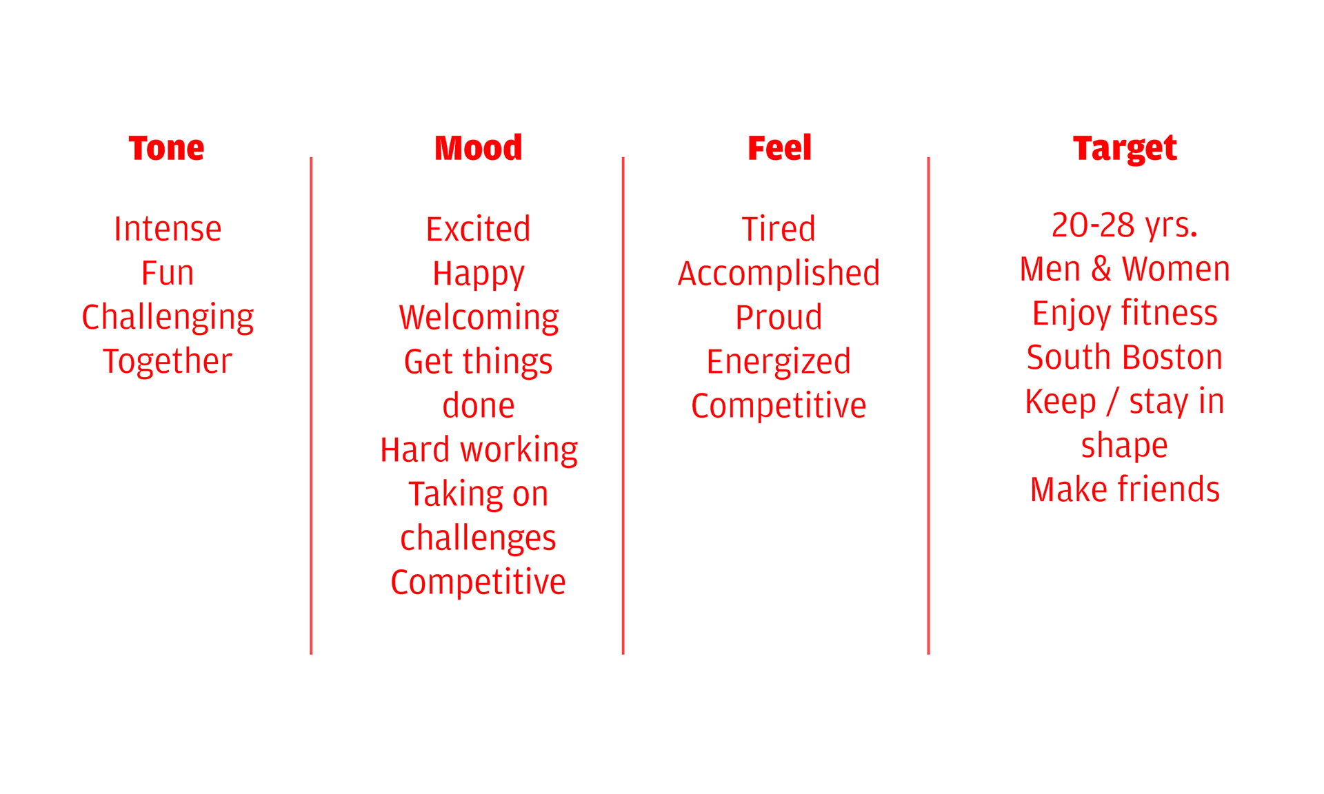
The project started with a conversation with Leah. I needed to understand the tone, mood, target audience, of her brand that she intended to show. Two words came to her mind, a) intense b) fun. I developed a moodboard and described the environment that someone would encounter if they were to join her group. The tone of the workouts and team, the mood of the atmosphere, and how people feel during her workouts. I felt this was the best way I could grasp the emotions and feelings of Leah's brand in order to convey them to someone else.
Typography
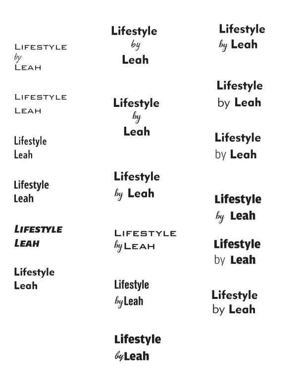
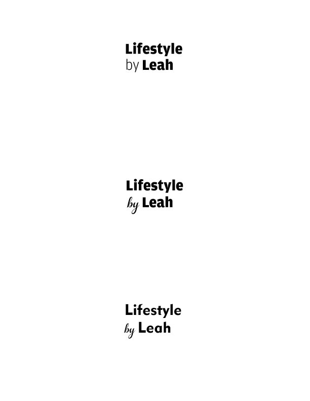
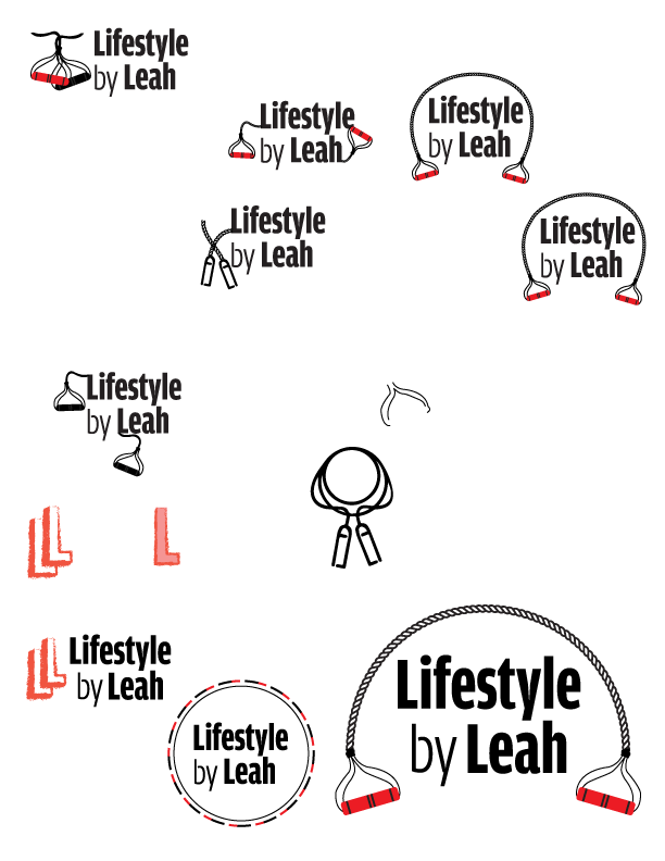
The images below show some examples of the typefaces I was playing around with. The image on the far right were the top three selects from my professor and I. I wanted to combine a balance of heavy text with light because I felt that was one way to show intensity. Bringing in a thin italic for the "by" was another attempt at trying to convey the "fun" aspect of this brand. In the end, I decided to stick with a simple typeface for the secondary typography.
Graphic for Logo
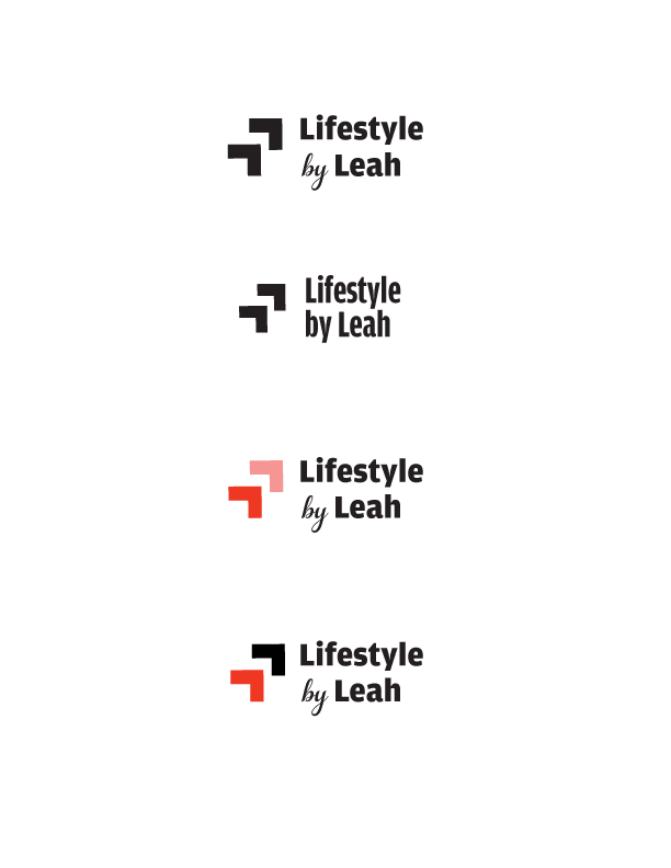
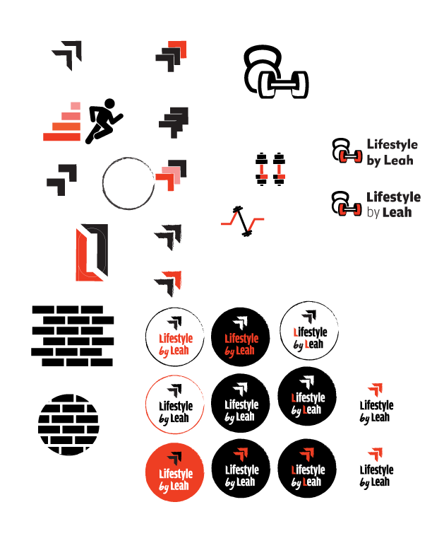
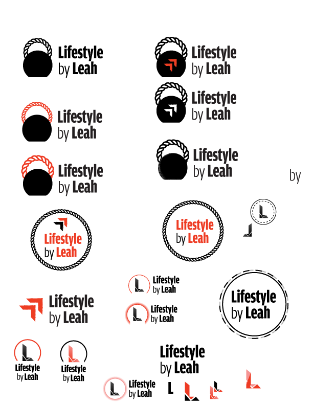
There was a formula my professor suggested I should follow that may help my process of creating this brand. She talked about all aspects of a brand: typography, logo, name, photography, icons, colors, etc. and how they all add up to the brand. Each asset has its own role to own and showcase to the public. I struggled to come up with a graphic logo that I felt best conveyed Leah's brand. The first idea I had was two L's pointing up, as if to signify increasing fitness and getting better, as well as including the L's from Lifestyle by Leah. My professor said that intention was not clearly met by her (middle image in typography section).
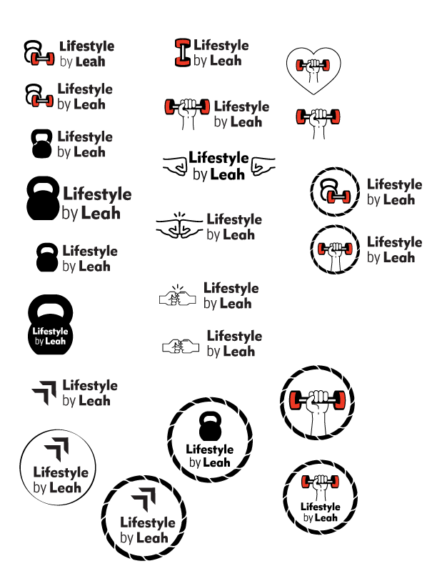
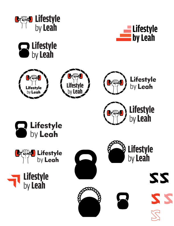
I then started to think about what aspects, other than the brand name, could I have within the graphic. It could be based on running, strength workouts, or community. I thought about motion and how I could convey a sense of motion within the graphic to suggest running. I grabbed icons that could represent strength workouts that I could manipulate to work within Leah's brand. I was hesitant to use kettlebells and barbells because Leah's strength exercises used more resistant bands and bodyweight, I did not want to convey the wrong message to the audience that these workouts would include that type of equipment.
I was also drawn to this rope asset I felt could be used to represent a resistant band. I did many iterations of this logo design because I did not feel I was creating something that represented her brand. In the end, my professor told me about that formula, and explained how I did not need to convey everything within the logo, rather all those assets needed to add up to portray what I was trying to say about Lifestyle by Leah. With that in mind, I decided to stay with a more abstract logo, one that was focused on the brand name, but did have an intention on my part (that may not be obvious to the audience).
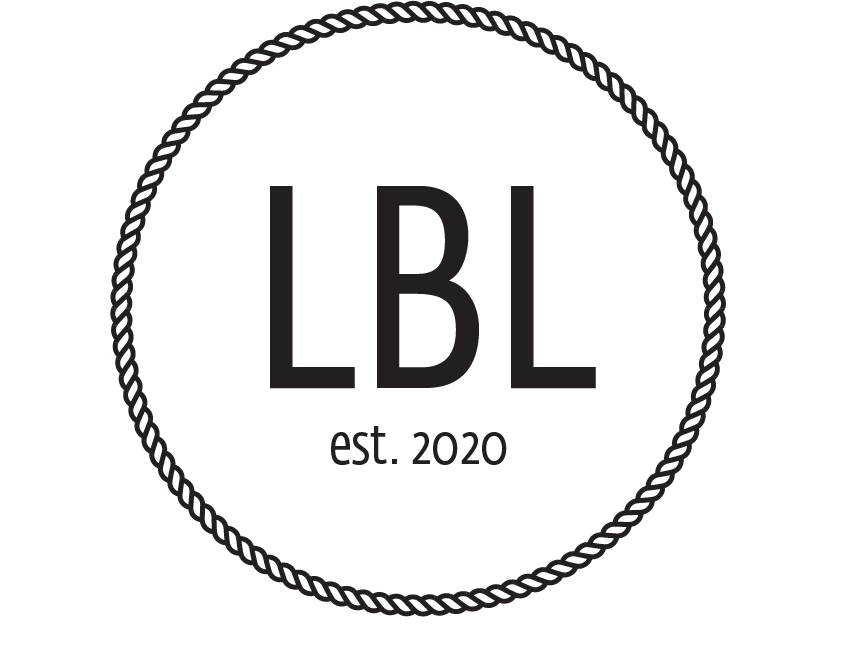
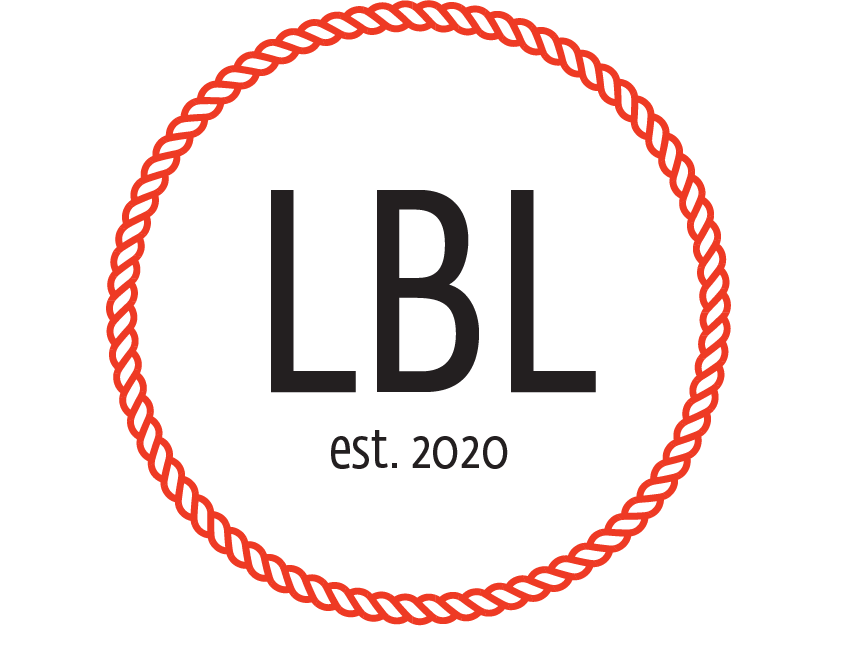
Final Logo

Leah also wanted a logo that just at "LBL" and an established year. My professor said to be careful about this because having two logos can make people confused as to if it is one brand or two. I created the logo for her, but kept it as a "vintage" logo, only to be used in special occasions.
Social Media Assets
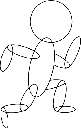
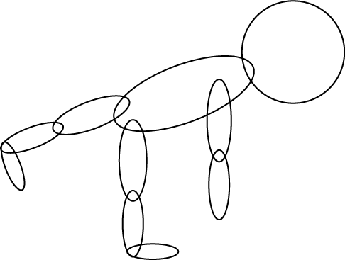
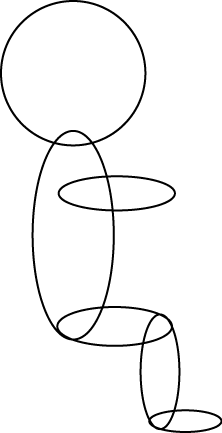
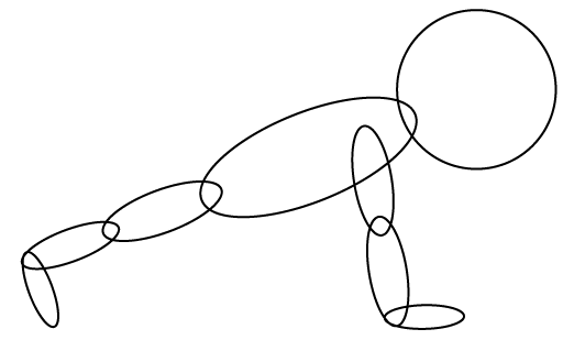
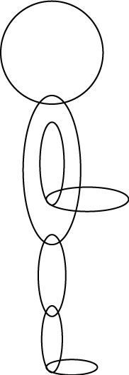
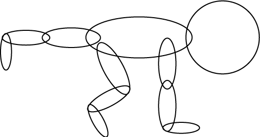
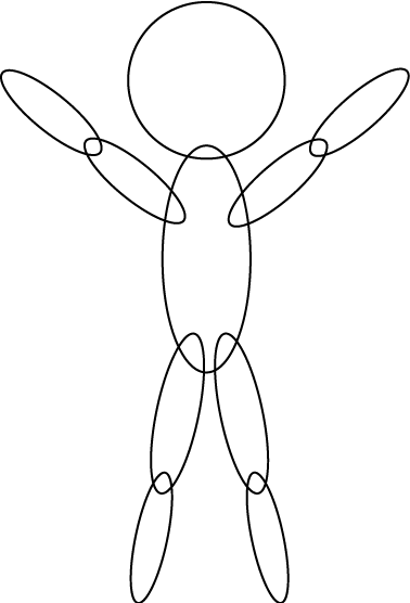
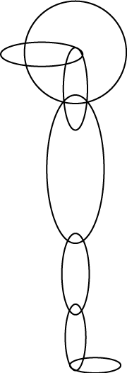
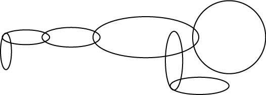
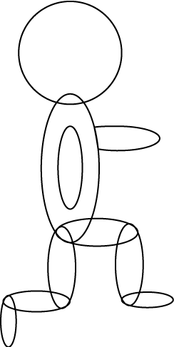
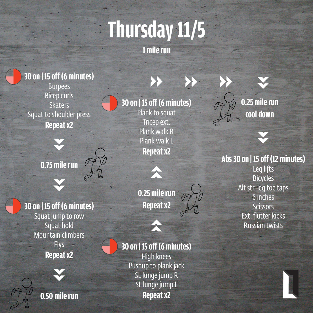
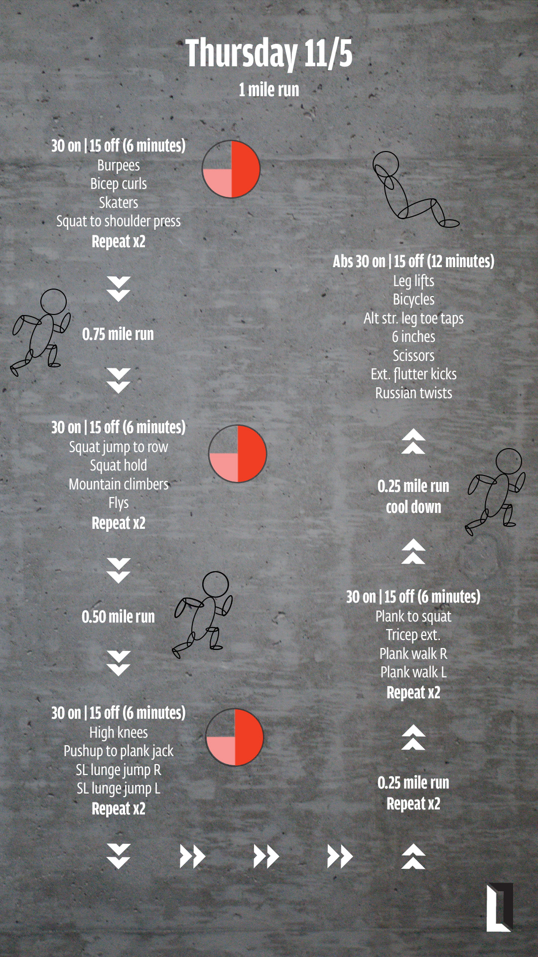
Social media was the only form of interaction Leah had of her brand when I started to work with her. So it was important to create cohesion across her account as well as the website I was going to develop for her. In terms of the brand formula, I used social media assets to showcase community and the workouts. Back to my thoughts about showing motion in her logo, I found a great way to show the workouts in a graphic form. In elementary school, I was taught how to draw the human body by using oval shapes. These drawings were extremely simple, but straight to the point and easily understood, something that is important for social media as your audience is really only looking at something for 3-5 seconds.


There was a lot of text needed for Leah's posts. So these icons were a good way to show a graphic but not take up too much space. During my logo creating process, I had taken the 'L' shape and created a arrow looking graphic. I went back to that asset and used it in the social media posts to move the reader from one circuit to the next.
Time was an important aspect of these workouts. I wanted to play around with showing time through a graphic as well. By using the rope graphic I created, I used the brand colors to represent when the user should be working out vs. rest time.
Being on Instagram, there was also an opportunity to create a story out of the workouts as well.
Photography
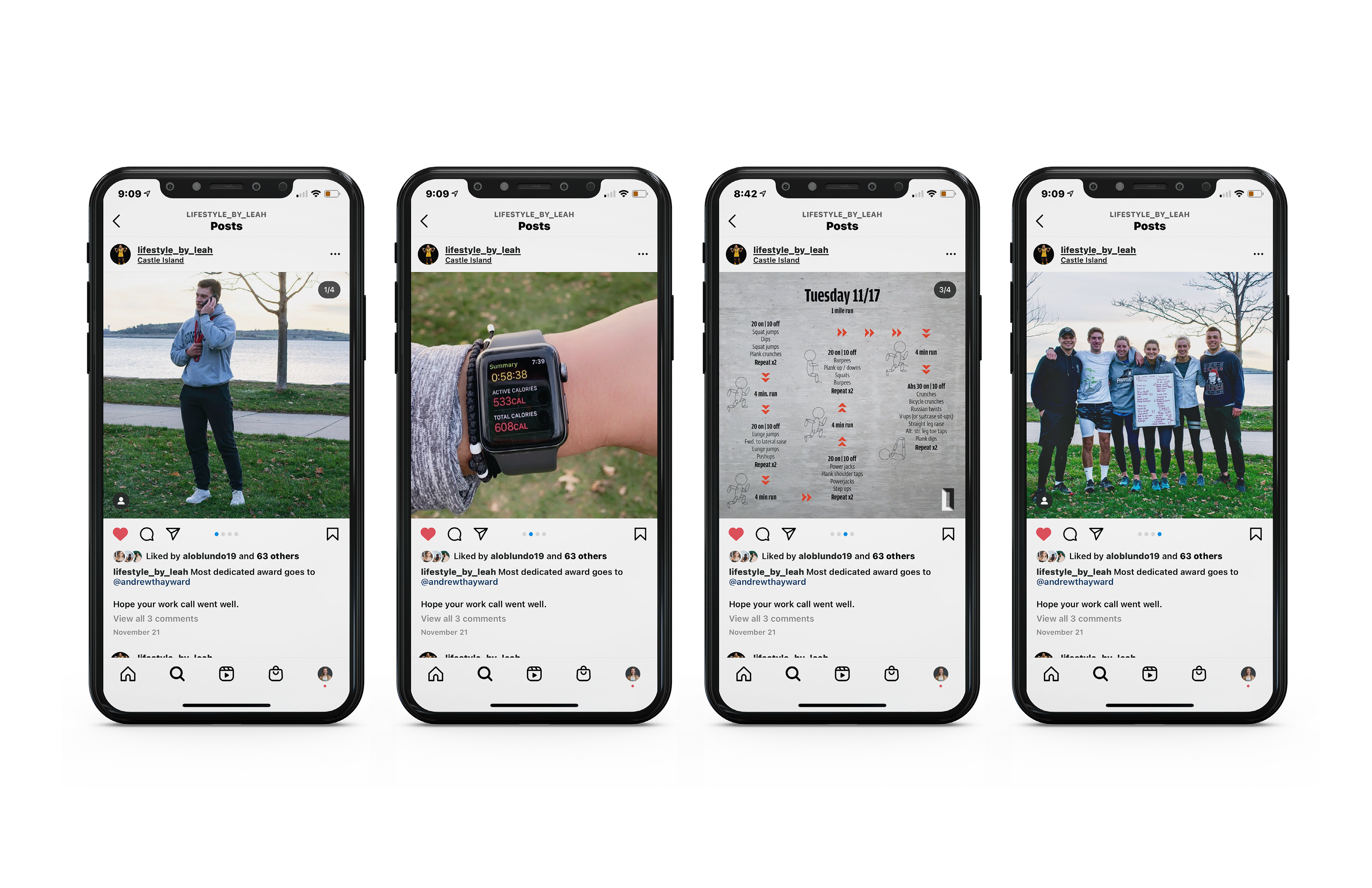
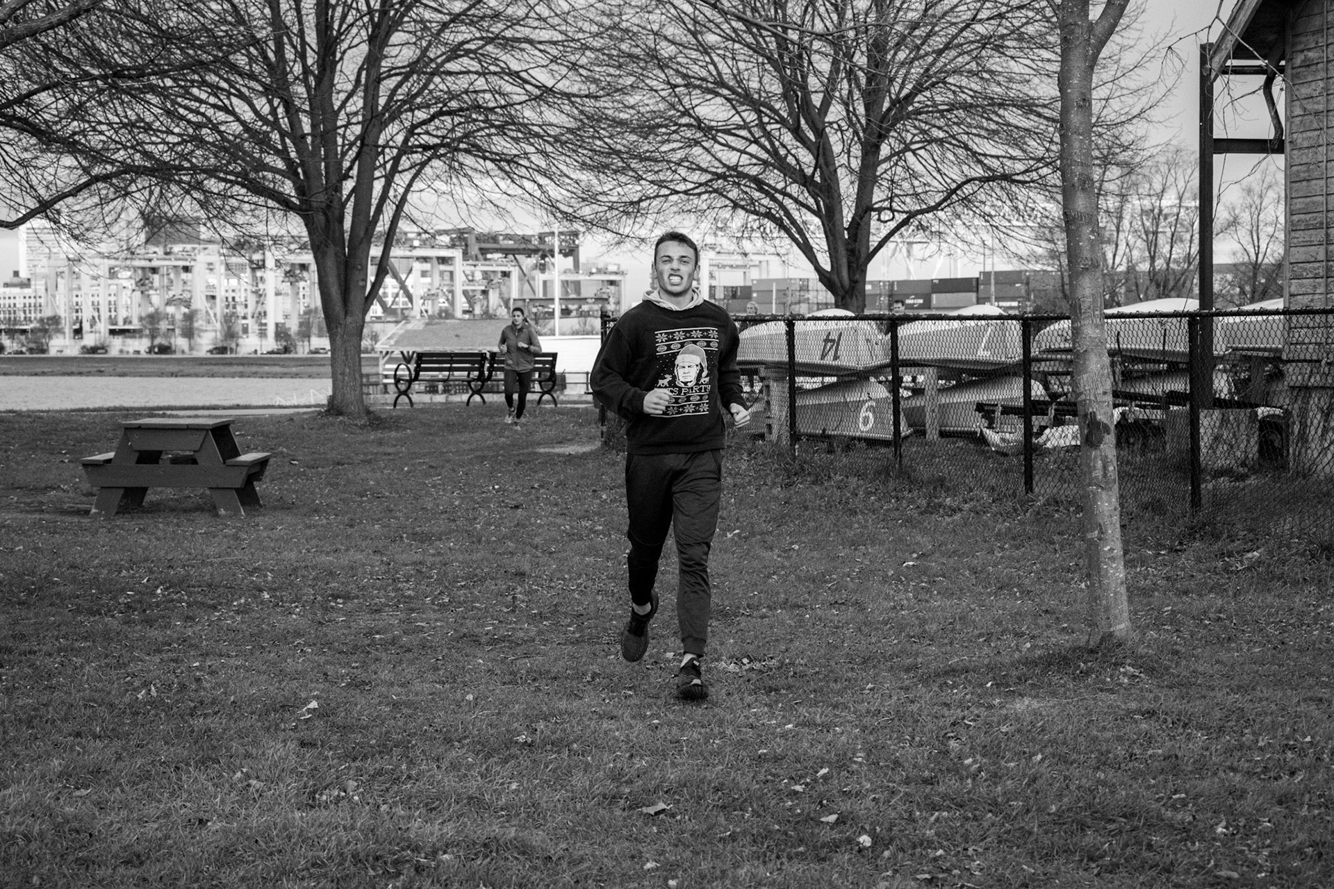
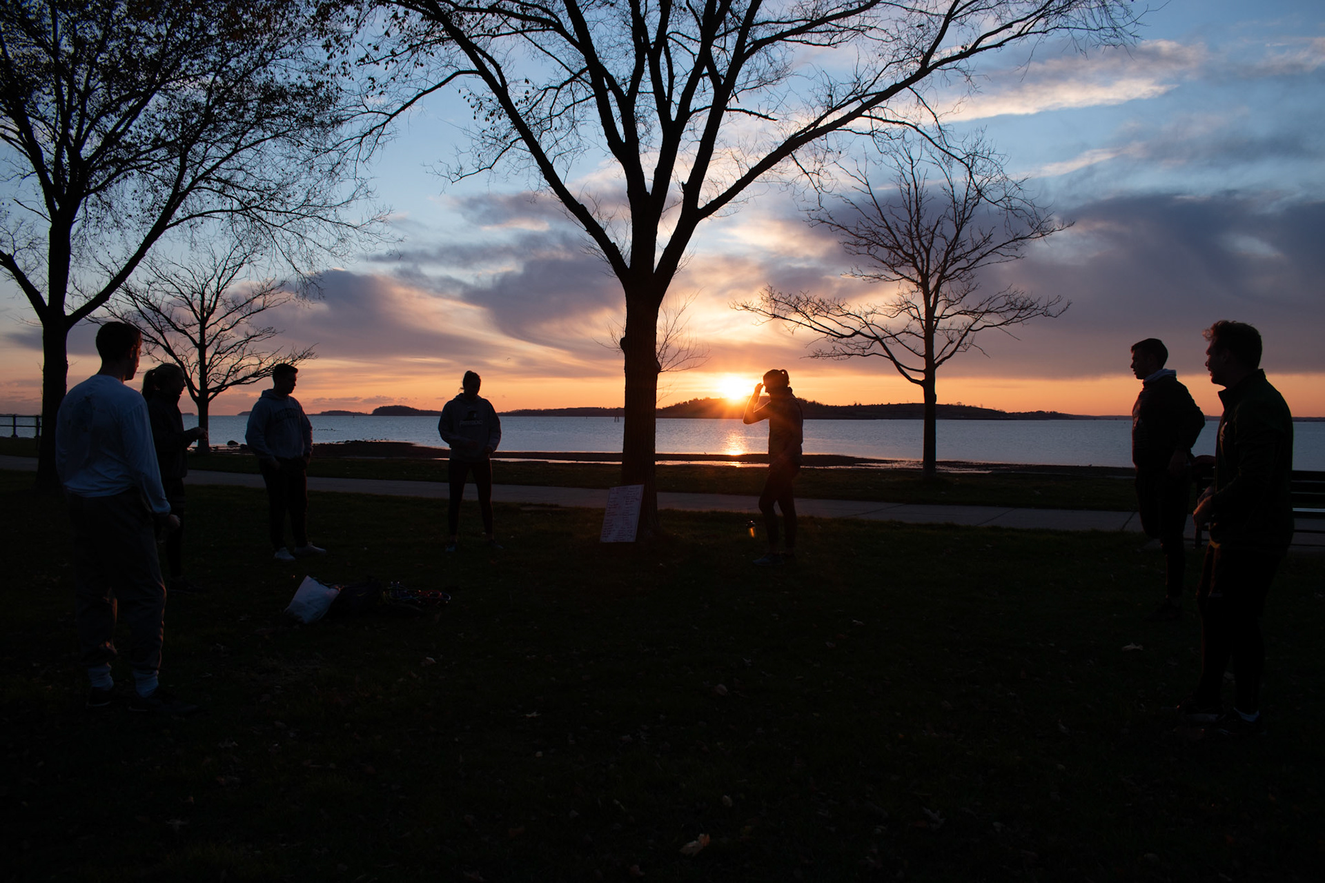
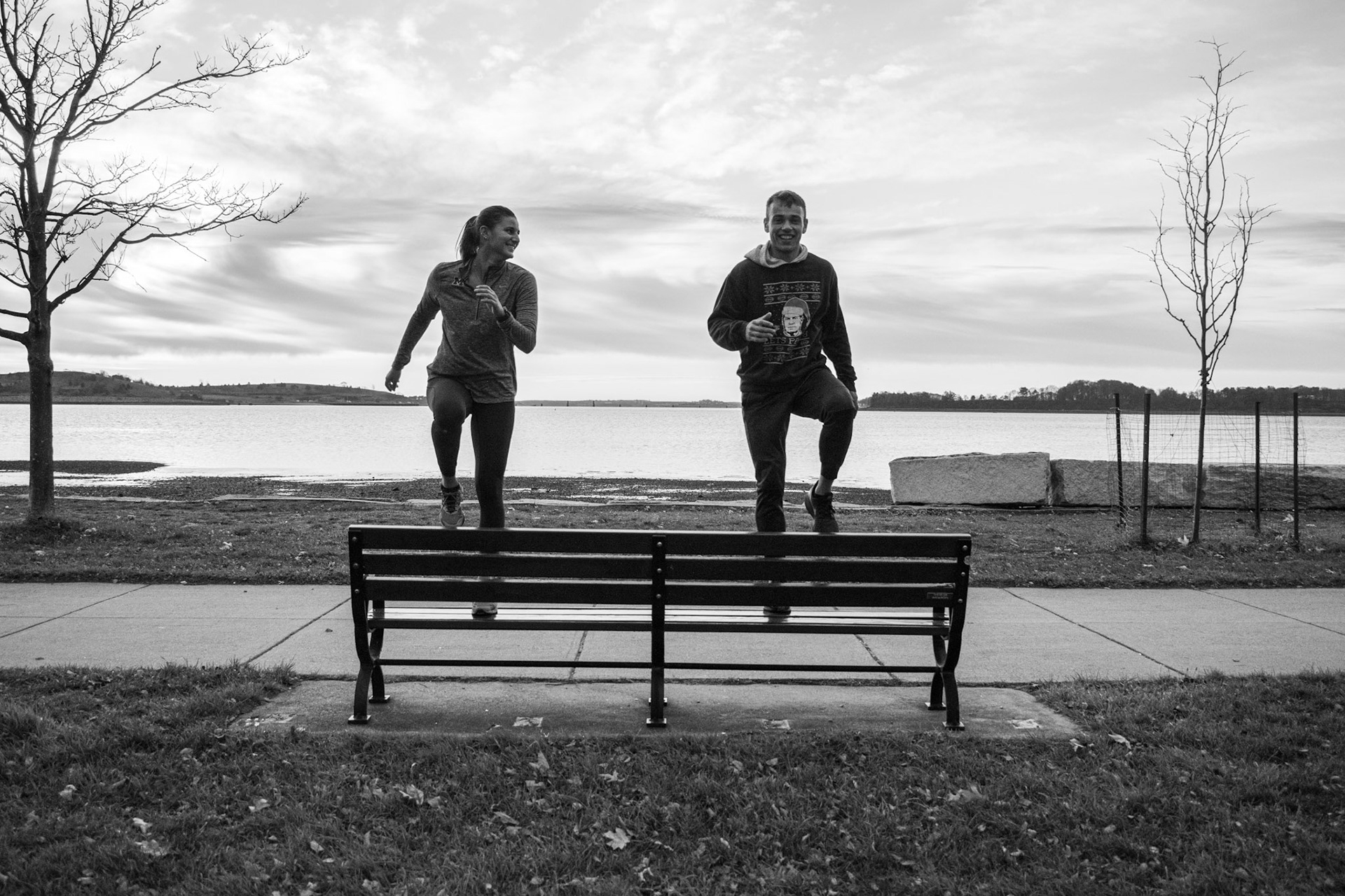
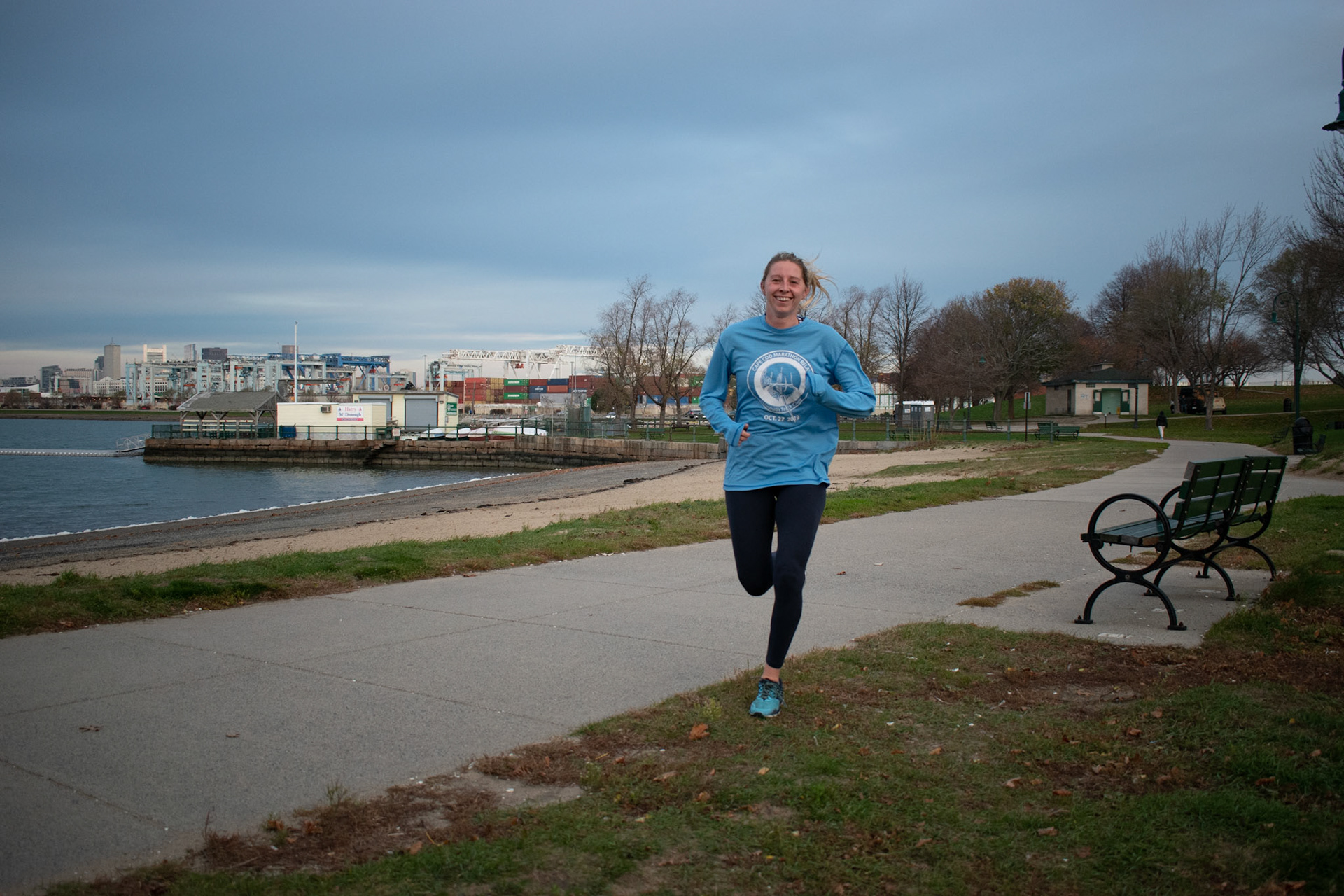
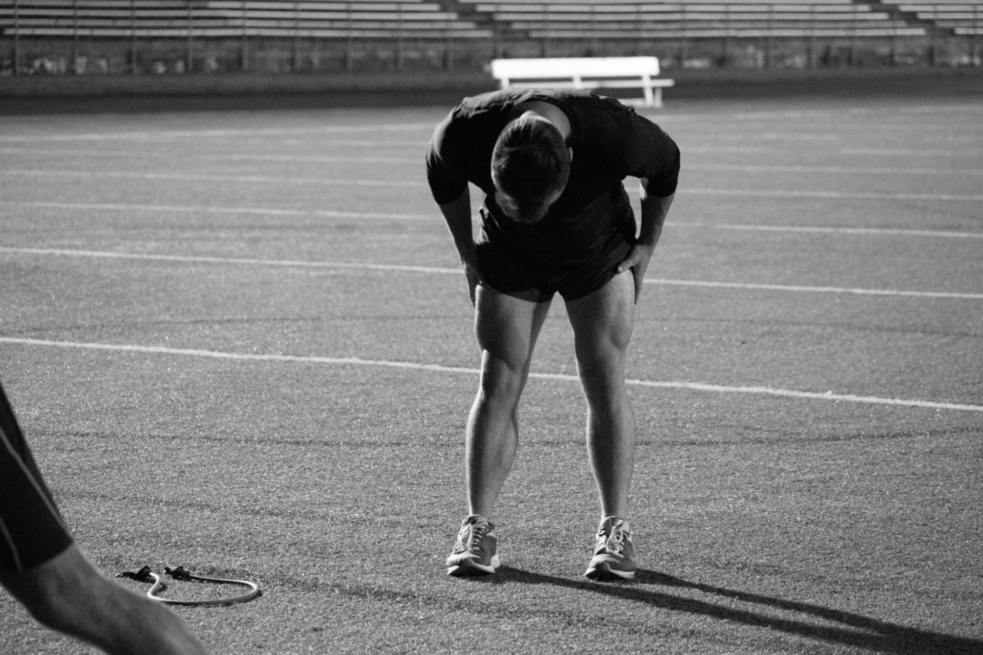
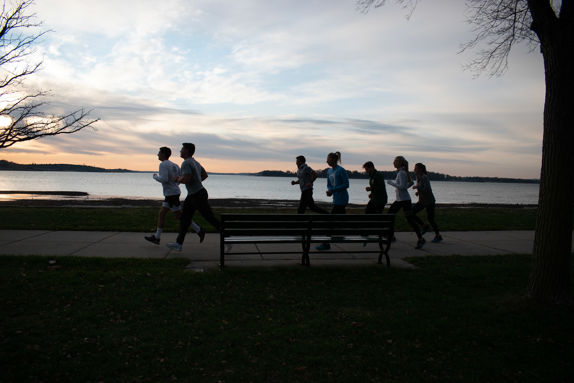
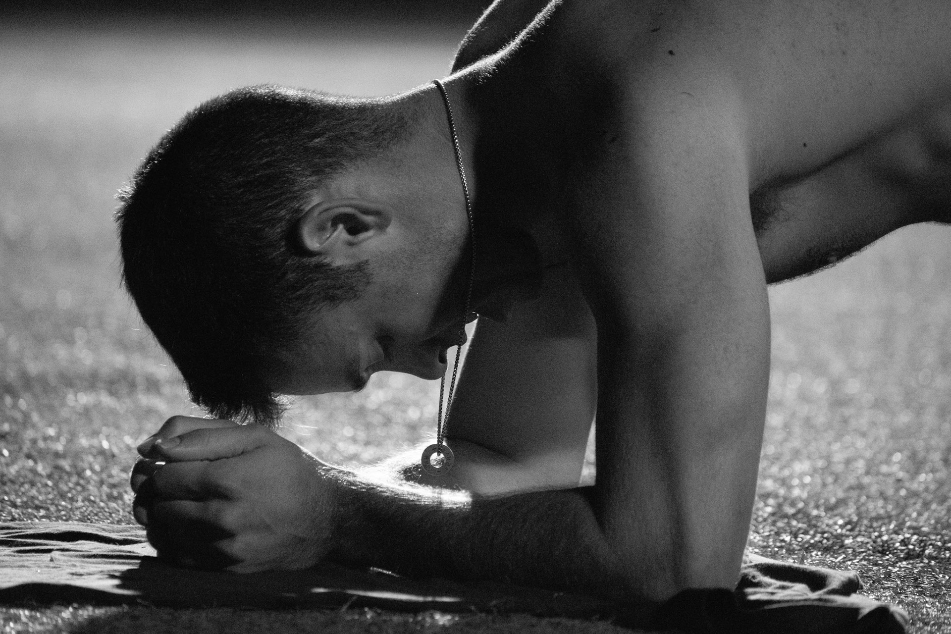
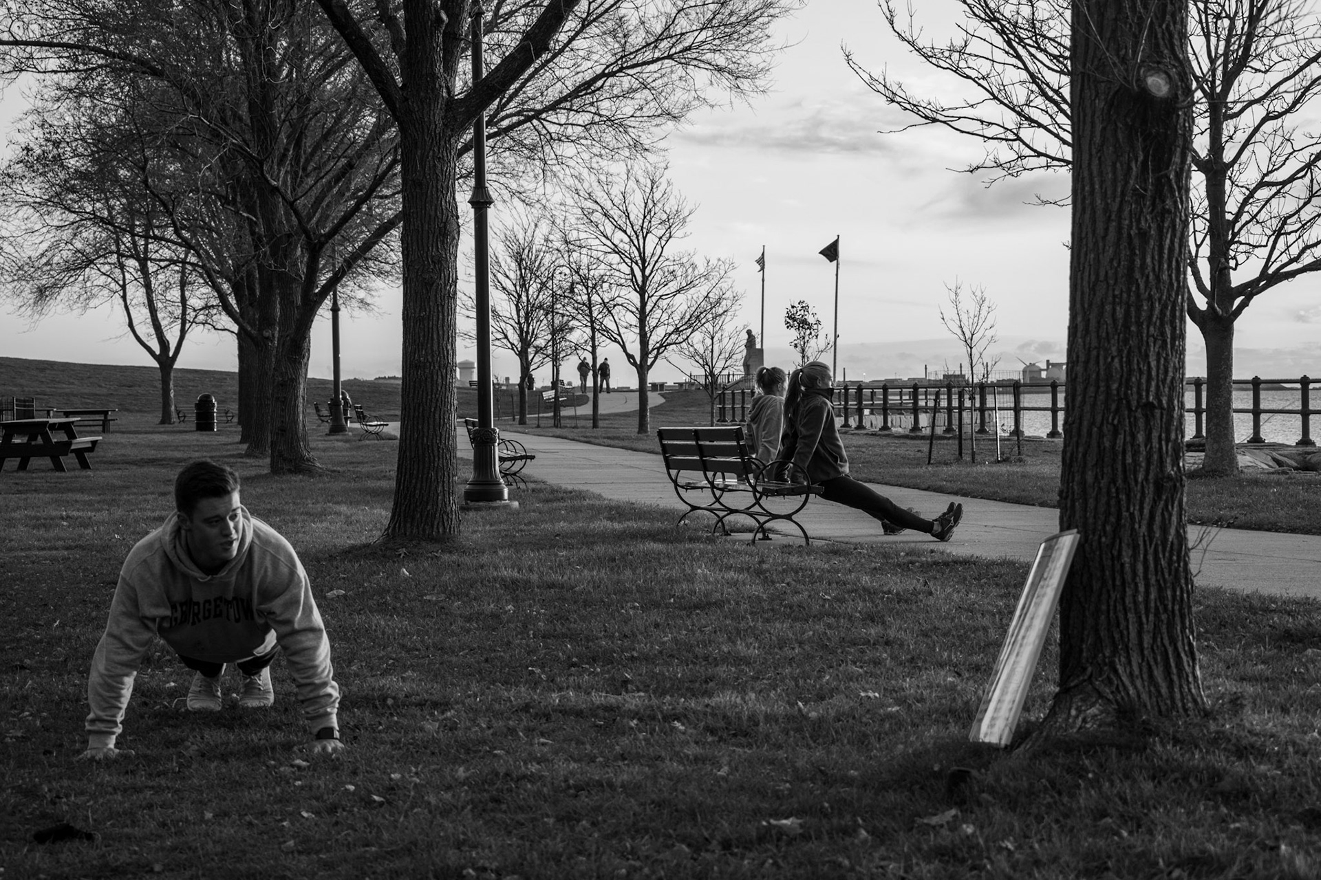
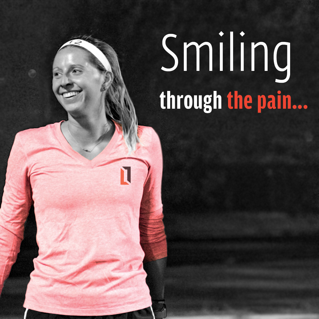
This brings me into the next portion of the project which is photography. Photography is a huge aspect of this project because it was my way of representing the brands community and atmosphere. Lifestyle by Leah in essence is a community. It is a group of people who love working out, staying healthy, and doing it together. There was constant talking, cracking of jokes, and laughter at these events and I needed to portray that through the photography. Most of the photography I placed in black and white, part of that reasoning was for people to focus on the content of the image rather than get distracted by the aesthetic. For some promotional pieces, shown next, I added in the brand colors to incorporate the brand identity.
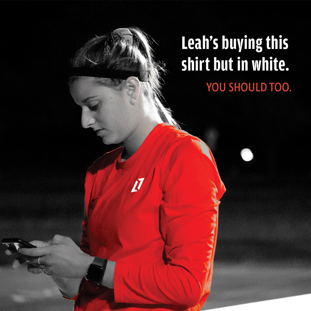
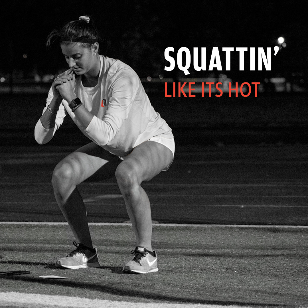
Promotional Assets
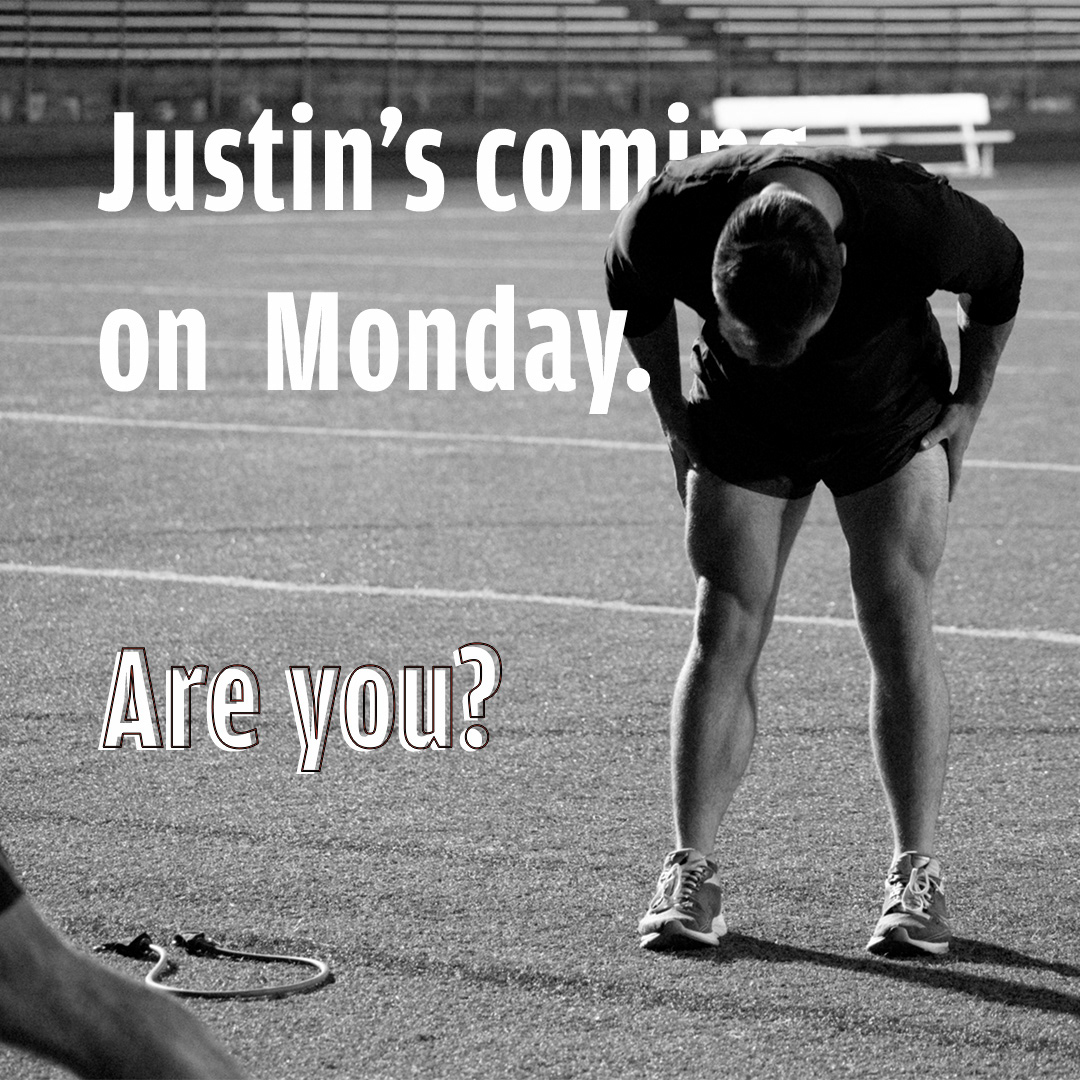
Along with the workout instagram posts, I also created some promotional posts that Leah could use to showcase her apparel and promote her brand. I wanted to combine text with photography along with using humor to show the brands personality.
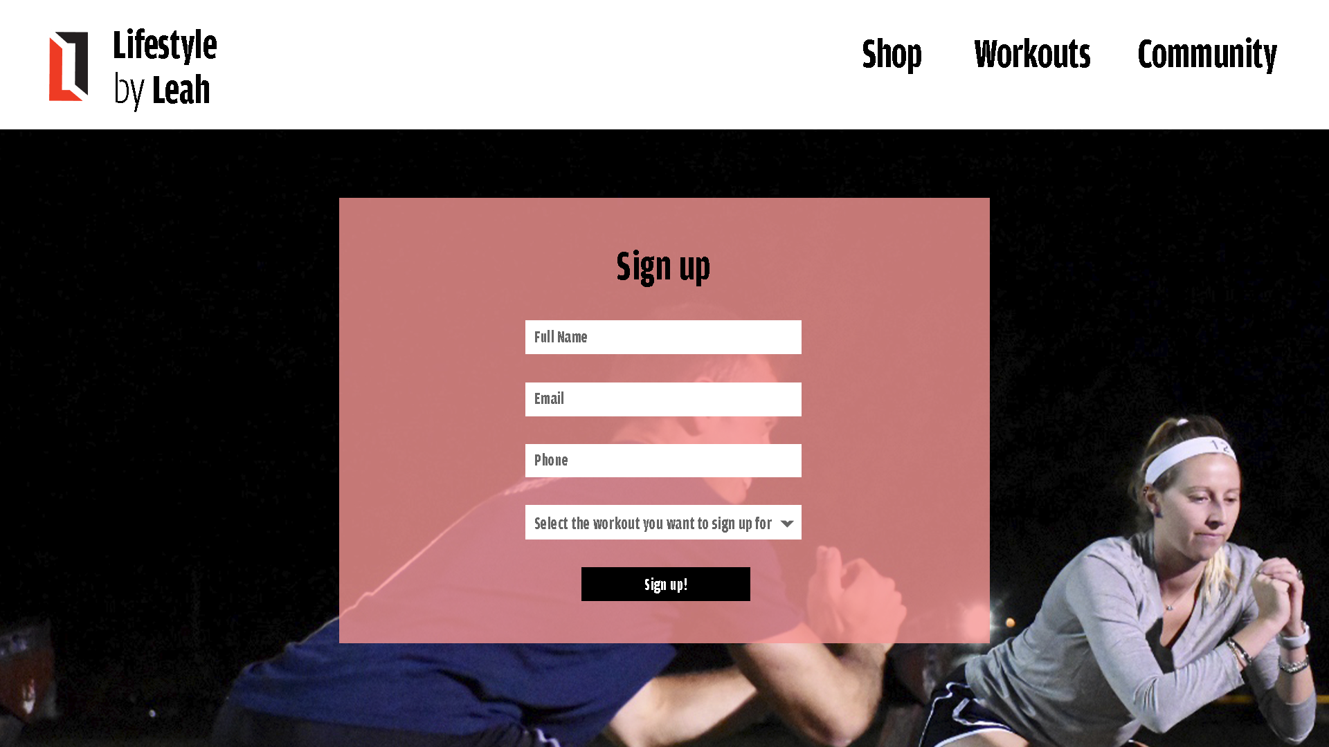
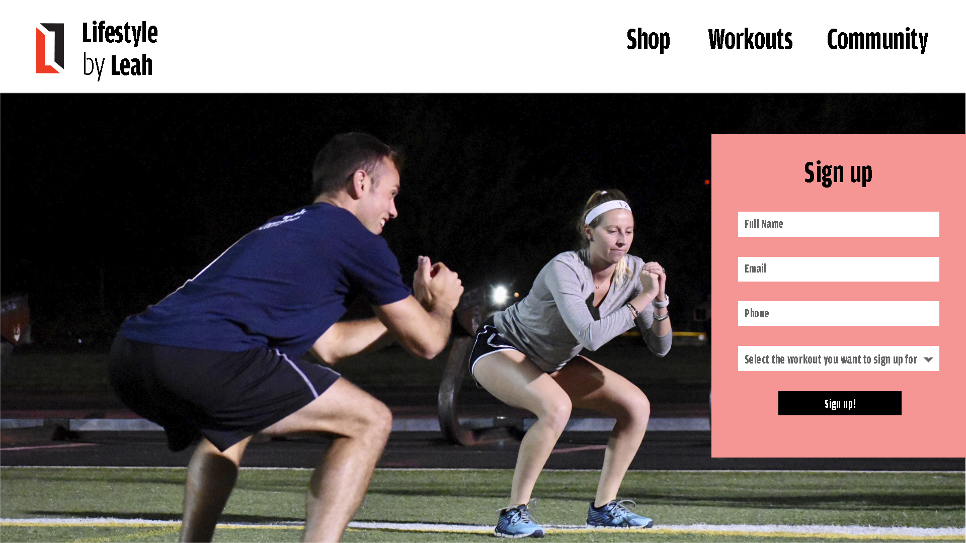
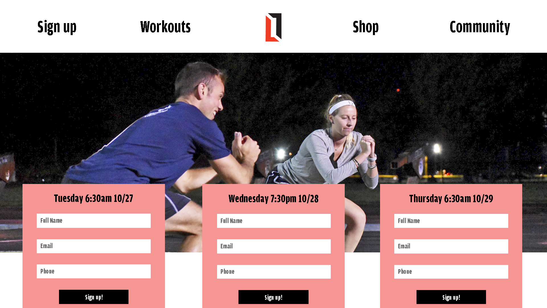
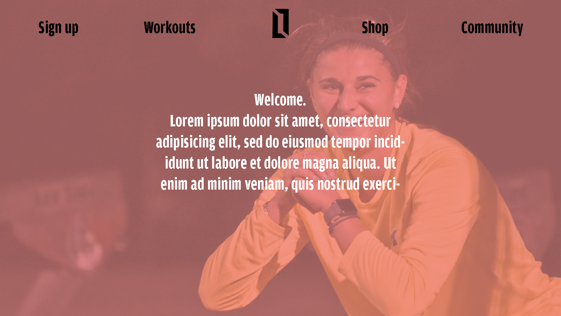
Website
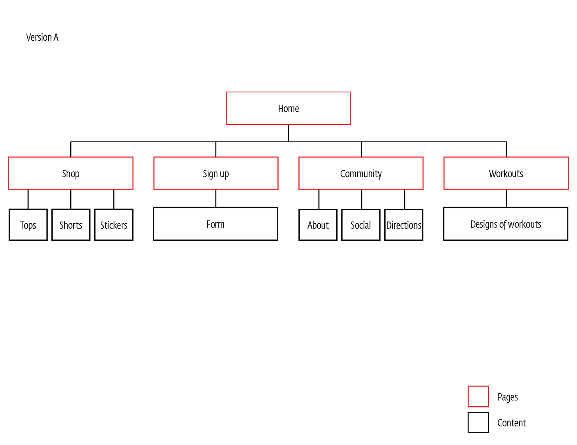
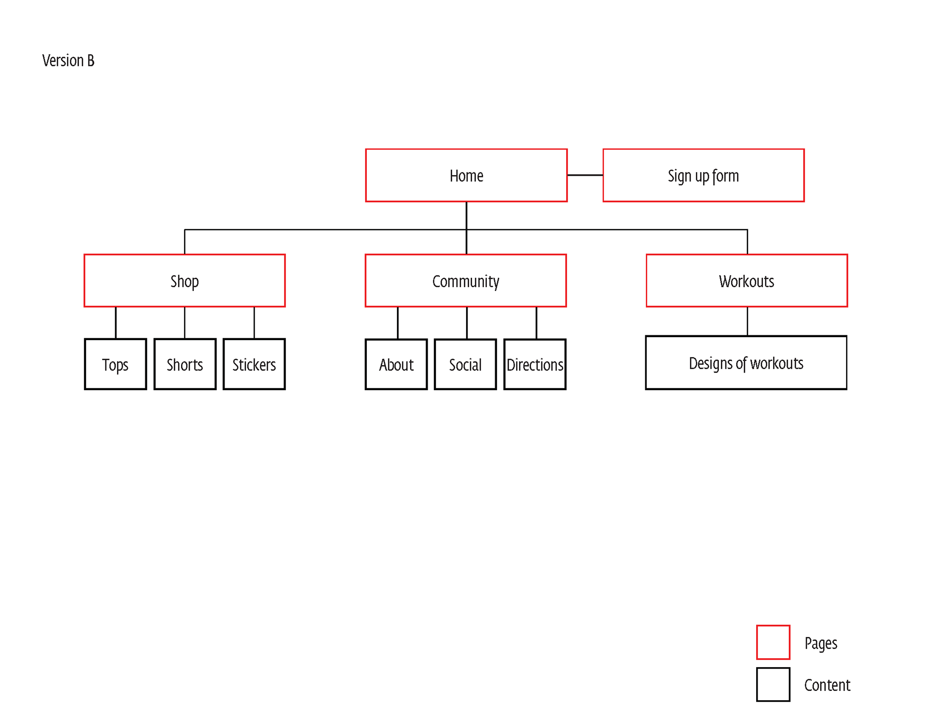
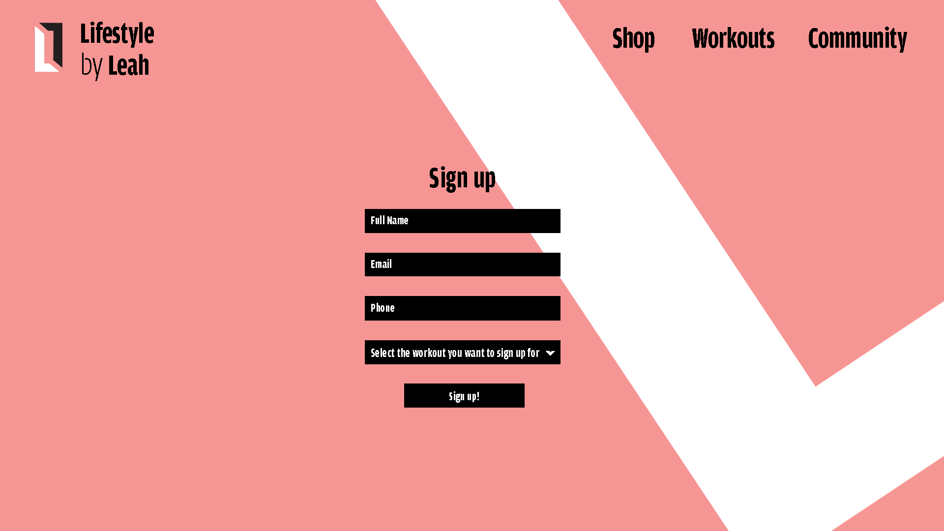
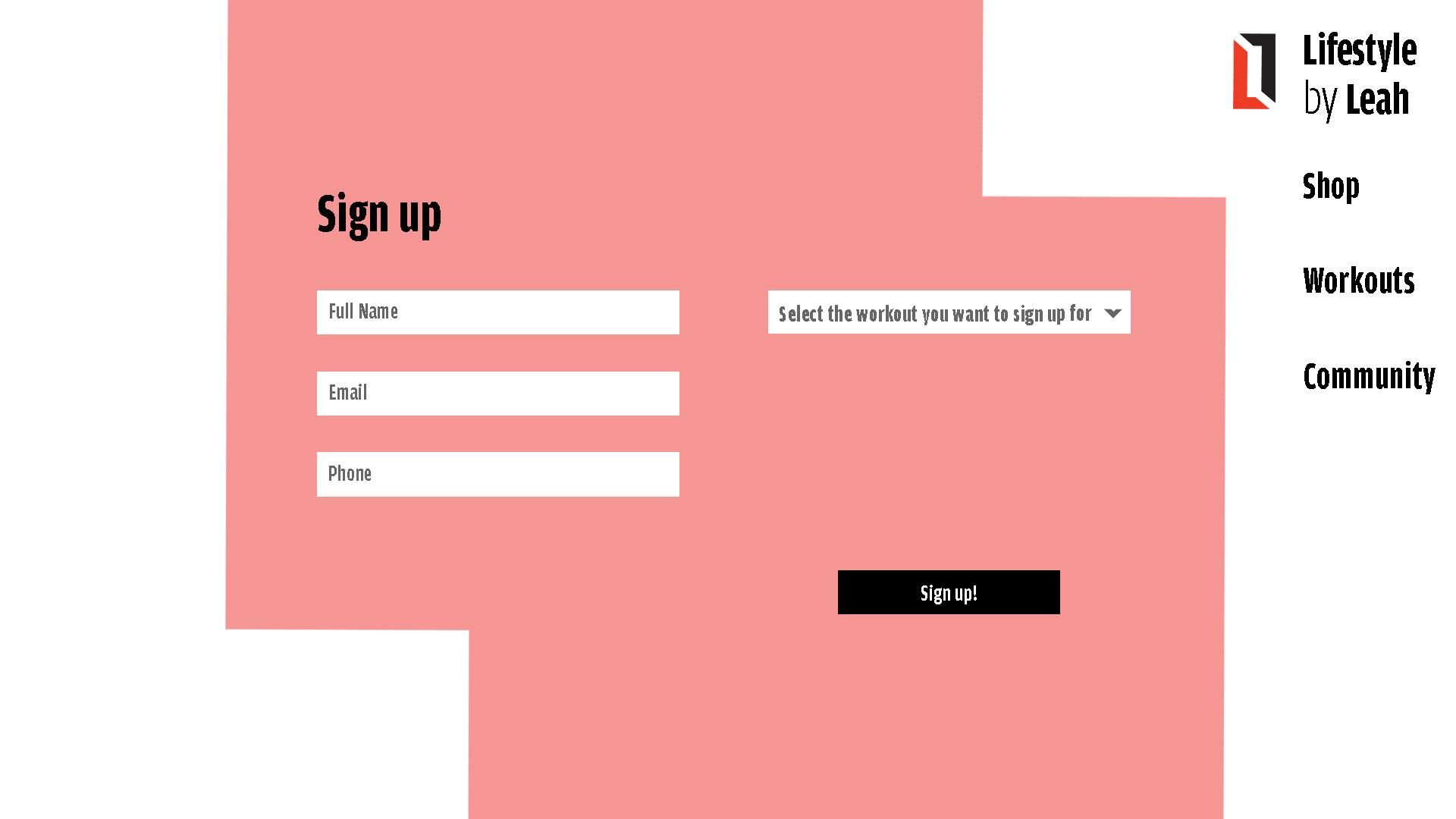
Lastly, I created the website. The website needed to have an about page, a page where people could go to find past workouts, a sign up page, and a store. The website is important because this is where everyone will go to sign up for Leah's workouts. It needed to be simple, straight forward, yet have all the information someone would need to learn about her brand. I started with creating sitemaps and thumbnails for the homepage.
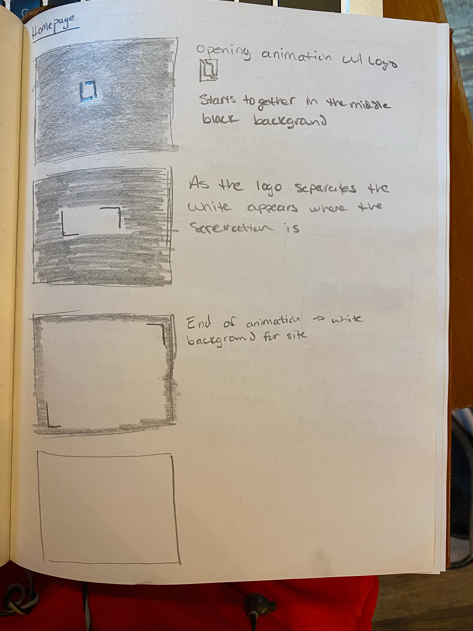
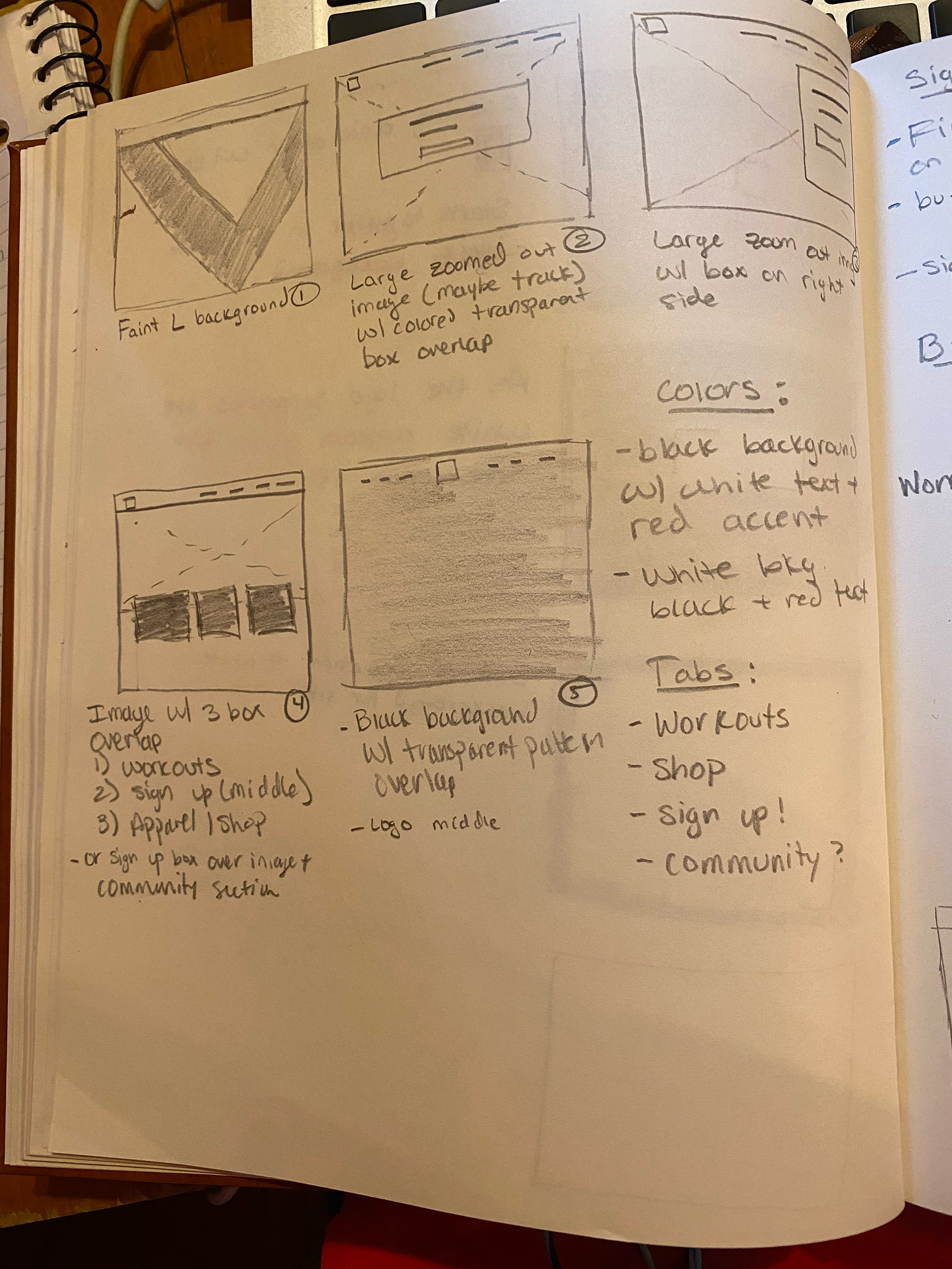
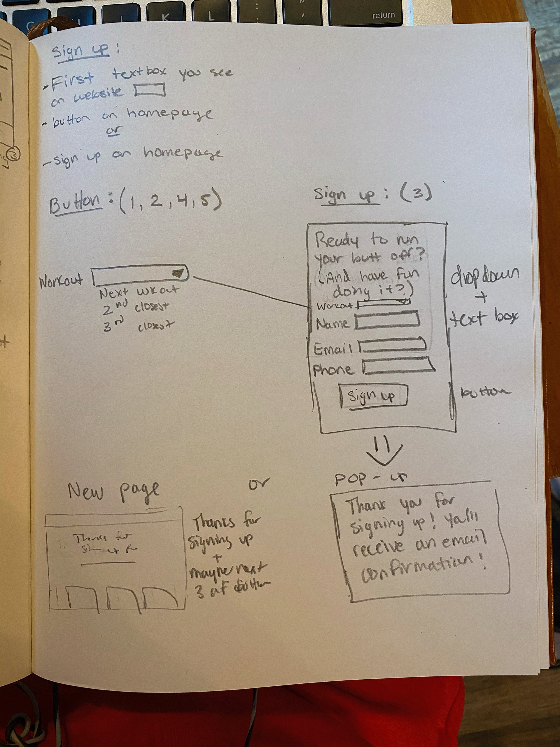
I originally wanted to have this animation that occurred when someone first entered the site. But due to my limitation with Wix, I was unable to fulfill this idea.